Applied Statistics for Data Science with Real-world Examples
Apply statistical concepts to solve practical data problems with real-world examples and implement them using Python code.

Statistics was always a dull subject for me in high school and college, something I mainly studied to pass my exams. The lack of a practical explanation, in my opinion, was the primary reason for this perception. Teachers and lecturers usually emphasized exam-oriented teaching methods while ignoring statistical applications in reality. As a result, I never really understood the practical application of statistical concepts.
When I started my journey in data science, I learned how important it was to revisit statistics with new eyes. I tried a variety of self-study methods, such as reading articles and watching YouTube videos, but none worked as well as applying statistical concepts to real-world data science projects.
In this article, I will demonstrate how I acquired a practical understanding of statistics by applying them to real-world data science scenarios. My objective is to illustrate statistical concepts commonly utilized in data analysis and preprocessing. The concepts covered include:
- Difference between Population and Sample
- Sampling Techniques
- Univariate Statistics (mean, median, mode)
- Standard Deviation and Variance
- Correlation
- IQR (Interquartile Range)
- Z-score
- Statistical Distributions (Normal Distribution, Binomial Distribution, Poisson Distribution)
- Central Limit Theorem
- Hypothesis Testing (Hypothesis Statement, Type 1 & 2 Errors, Fundamental Components, Z-test, T-test, ANOVA, Chi-Square Test)
The approach in this article involves:
- Describe the Formula: Explain each concept’s mathematical formula.
- Practical Application: Showcase how the concept is applied in real data analysis and preprocessing scenarios.
- Python Code: Write these principles in Python, focusing on real-world scenarios. (Some notions may already be in use in libraries, and I’ll showcase how to use them efficiently)
Let’s get started🚀
#1 Population and Sample
Imagine your city government tasks you with gathering feedback on public transportation to facilitate improvements. The city boasts a diverse population of 400,000 residents, spanning various neighborhoods, age groups, and educational backgrounds. This entire group constitutes our Population (represented by the symbol N). However, engaging all 400,000 residents for feedback is impractical. Hence, we opt for a more manageable approach by randomly selecting 1000 residents from different neighborhoods and demographic groups. This selected group becomes our Sample (represented by the symbol n) for analysis.

In simple terms, the Population is our entire focus, whether it’s the entire city’s citizens or all the users of the platform. The Sample, on the other hand, is a carefully chosen subset of the population for in-depth analysis.
Selection Bias:
Selection bias is an error that happens when the sample or selected group does not represent the population or target of our analysis. For instance, if our goal is to Test the performance of a new feature in our platform and our sampling we include people who only installed the app and had no engagement during the past 2 weeks.
#2 Sampling Techniques

You must select different sampling procedures based on the question you are asking from the data and the nature of the subject. I’ll demonstrate four different types of samples:
1- Random Sampling:
Every data point in the population has an equal probability of being selected in random sampling. A manufacturing company, for example, produces 500 units of product each day. The quality control team issues a unique ID to each product and chooses ten products at random for examination.
import random

# List of unique product IDs
all_products = list(range(1, 500))  # Assuming 500 products

# Specify the sample size
sample_size = 10

# Perform simple random sampling
random_sample = random.sample(all_products, sample_size)

# Output
[446, 51, 491, 87, 161, 6, 18, 24, 492, 183]
When not to employ it: Avoid simple random sampling if your population has distinct subgroups with important differences. In such cases, more targeted methods may be suitable.
2- Stratified Sampling:
This method involves considering a factor and sampling based on that. For instance, on a platform like Spotify, you might sample from premium users to measure the quality of weekly recommendations.
import random

# Simulated data: user IDs and their corresponding levels
user_data = {
    'user1': 'free',
    'user2': 'premium',
    'user3': 'free',
    'user4': 'premium',
    'user5': 'premium',
}

# Specify the desired sample size
total_sample_size = 3  # Total number of users to be selected

# Define the strata (user levels)
strata = ['free', 'premium']

# Initialize an empty dictionary to store samples from each stratum
stratum_samples = {level: [] for level in strata}

# Perform stratified sampling
for level in strata:
    # Get all user IDs for the current stratum
    stratum_users = [user_id for user_id, user_level in user_data.items() if user_level == level]

    # Determine the stratum sample size based on the proportion of users in the stratum
    stratum_sample_size = int(total_sample_size * len(stratum_users) / len(user_data))

    # Randomly sample from the current stratum
    stratum_samples[level] = random.sample(stratum_users, stratum_sample_size)

# Combine samples from all strata to get the final stratified sample
stratified_sample = [user_id for level_samples in stratum_samples.values() for user_id in level_samples]

# Output
 ['user1', 'user4']
When not to employ it: Avoid stratified sampling if the characteristics used for stratification do not significantly affect the study outcomes. In such cases, simple random sampling may be more efficient.
3- Systematic Sampling:
Similar to random sampling, systematic sampling involves selecting every ‘k’-th item after a random starting point. For instance, if analyzing customer transactions, you might select every 10th transaction.
import random

# Simulated data: List of customer transactions represented by unique IDs
transaction_data = list(range(1, 101))  # Assuming 100 transactions

# Specify the sampling interval
sampling_interval = 10

# Choose a random starting point between 1 and the sampling interval
random_start = random.randint(1, sampling_interval)

# Perform systematic sampling
systematic_sample = transaction_data[random_start-1::sampling_interval]

# Print the systematic sample
print("Systematic Sample:", systematic_sample)

# Output
Systematic Sample: [8, 18, 28, 38, 48, 58, 68, 78, 88, 98]
When not to employ it: Avoid systematic sampling if there is a periodic pattern in the data coinciding with the sampling interval. This could lead to a biased sample.
4- Cluster Sampling:
Cluster sampling involves sampling entire groups based on a factor such as age groups or regions. For a study on urban air quality, you might divide a city into districts and randomly select a few districts.
import random

# Simulated data: List of districts in the city
districts_list = ['District A', 'District B', 'District C', 'District D', 'District E']

# Specify the number of districts to select
num_districts_to_select = 2

# Perform cluster sampling by randomly selecting districts
selected_districts = random.sample(districts_list, num_districts_to_select)

# Simulated data: Air quality data for all locations in the city
all_locations_data = {
    'District A': [20, 25, 18, 22, 23],
    'District B': [15, 28, 20, 24, 21],
    'District C': [19, 22, 25, 18, 20],
    'District D': [17, 19, 21, 23, 26],
    'District E': [16, 24, 19, 22, 27]
}

# Collect air quality data from all locations within the selected districts
selected_districts_data = {district: all_locations_data[district] for district in selected_districts}

# Print the selected districts and their corresponding air quality data
print("Selected Districts:", selected_districts)
print("Air Quality Data for Selected Districts:", selected_districts_data)

# Output
Selected Districts: ['District B', 'District D']
Air Quality Data for Selected Districts: {'District B': [15, 28, 20, 24, 21], 'District D': [17, 19, 21, 23, 26]}
When not to employ it: Avoid cluster sampling if the variability within clusters is high. If the chosen clusters are not representative of the overall population, it can lead to biased results.
5- Convenience Sampling
Convenience sampling is a non-probability sampling technique in which individuals are chosen based on their accessibility rather than at random. In this strategy, the researcher selects volunteers who are conveniently accessible. Conducting a brief market survey at a shopping mall by asking passers-by is an example of convenience sampling.
# Simulating convenience sampling in a shopping mall
def convenience_sampling(population, sample_size):
    # Assuming population represents the entire population
    # and sample_size is the desired size of the convenience sample
    convenience_sample = np.random.choice(population, size=sample_size, replace=False)
    return convenience_sample

# Example usage:
total_population = pd.DataFrame({
    'Individual_ID': np.arange(1, 1001),
    'Age': np.random.randint(18, 65, size=1000),  # Assuming an age column for demonstration
    'Income': np.random.randint(20000, 100000, size=1000)  # Assuming an income column for demonstration
})

sample_size = 50  # Adjust the sample size as needed

convenience_sample_result = convenience_sampling(total_population['Individual_ID'], sample_size)

# Creating a DataFrame for the convenience sample
convenience_sample_df = total_population[total_population['Individual_ID'].isin(convenience_sample_result)]
When not to employ it: Avoid convenience sampling when the aim is to generalize results to a larger population. This method may introduce selection bias since individuals who are easily accessible might not accurately represent the diversity of the entire population.
#3 Univariate Statistics

1- Mean:
Mean shows the average value of our data points. Think of it as the pulse of our dataset, shedding light on where the majority of our data buddies tend to gather. Simply sum up all the values and divide by the total number of data points. It’s a straightforward way to gauge the central tendency of our data.
Formula : (Sum of all data points) / (Number of all data points)
Symbols: Population: μ, Sample: x̄
Shorting Information:
Assume you’re the CEO of a thriving online platform, and you’re interested in the daily pulse of user registrations — how many people join your site each day, giving you a sense of its popularity. The code snippet above acts as a virtual assistant, reducing this complexity to a single, comprehensible number.
import pandas as pd

# Assuming you have a DataFrame 'df' with columns 'day' and 'registered_users'
# Replace this with your actual dataset

# Sample data
data = {'day': ['Monday', 'Tuesday', 'Wednesday', 'Thursday', 'Friday', 'Saturday', 'Sunday'],
        'registered_users': [100, 120, 90, 110, 130, 140, 120]}

df = pd.DataFrame(data)

# Calculate the average number of registered users per day
average_users_per_day = df['registered_users'].mean()

# Output
Average Number of Users Registered per Day: 116
Comparison:
You work for a customer service department of an e-commerce company, and your team is interested in understanding the average satisfaction level of customers who recently interacted with the company’s support services
import pandas as pd

# Assuming you have a DataFrame 'df' with columns 'date' and 'registered_users'
# Replace this with your actual dataset

# Sample data
data = {'date': pd.date_range(start='2023-01-01', periods=14),
        'registered_users': [100, 120, 90, 110, 130, 140, 120, 110, 130, 95, 115, 135, 145, 125]}

df = pd.DataFrame(data)

# Extract week from the date
df['week'] = df['date'].dt.isocalendar().week

# Calculate the average number of registered users per day for each week
average_users_per_week = df.groupby('week')['registered_users'].mean()

# Output
Average Number of Users Registered per Day for Each Week:
week
1     117.0
2     124.0
52    100.0
Handling Missing Data:
Filling missing values (null values) in a column is a simple strategy especially since values are random (there is no relationship between the values of the column). For instance, you have a dataset containing information about the salaries of employees in a company. Some entries in the ‘salary’ column are missing, and you want to fill those null values with the mean salary.
import pandas as pd
import numpy as np

# Sample DataFrame with null values
data = {'employee_id': [1, 2, 3, 4, 5, 6],
        'salary': [60000, 75000, np.nan, 90000, np.nan, 80000]}
df = pd.DataFrame(data)

# Calculate the mean salary
mean_salary = df['salary'].mean()

# Fill null values with the mean salary
df['salary_filled'] = df['salary'].fillna(mean_salary)
2- Median:
Median values are used to represent the typical or central value in a dataset, especially when comparing different groups or categories. For instance, when comparing the income levels of employees in various departments of a company, the median salary is employed to find the middle point. Unlike the mean, the median is less influenced by extreme values, making it a valuable measure for understanding the central tendency in scenarios where outliers may significantly impact the average. This makes the median a robust choice for assessing the representative salary in different departments, ensuring a more accurate portrayal of the typical employee’s earnings.
The way it works is by sorting data points accidentally and picking the middle number that separates data points into two equal lengths.
Robust Measure of Central Tendency:
The median is a robust measure of central tendency that is less sensitive to extreme values (outliers) than the mean. In situations where the dataset has outliers, the median can provide a more representative measure of the “typical” value.
import pandas as pd
import numpy as np

# Generate a skewed income distribution for employees
np.random.seed(42)
employee_incomes = np.concatenate([np.random.normal(60000, 15000, 800),
                                   np.random.normal(120000, 30000, 50)])

# Create a DataFrame
employee_df = pd.DataFrame({'Employee_ID': range(1, len(employee_incomes) + 1),
                             'Income': employee_incomes})

# Calculate mean and median
mean_employee_income = employee_df['Income'].mean()
median_employee_income = employee_df['Income'].median()

# Output
Mean Employee Income: 63633
Median Employee Income: 61087
Handling Missing Data:
Median is also a good way to fill in the missing values. in some cases when we have extreme values in our dataset, using the median would be a suitable choice. Just like the previous example where we had employees with higher income than the majority.
employee_data['Income_imputed'] = employee_data['Income'].fillna(median_salary)3- Mode:
In statistics, mode represents the most frequent value. It can be considered as a metric. it is often used for categorical and discrete types of data
Identifying Most Common Values:
A big international e-commerce company like Amazon wants to find out the most purchased items in each country. that’s where mode comes in:
import pandas as pd

# Sample dataset representing e-commerce transactions
data = {
    'Country': ['USA', 'USA', 'USA', 'Canada', 'Canada', 'UK', 'UK', 'Germany', 'Germany', 'Germany'],
    'Item': ['Laptop', 'Book', 'Laptop', 'Book', 'Book', 'Laptop', 'Laptop', 'Book', 'Book', 'Phone']
}

# Create a DataFrame
ecommerce_df = pd.DataFrame(data)

# Find the mode for each country
modes_by_country = ecommerce_df.groupby('Country')['Item'].apply(lambda x: x.mode().iloc[0])

# Output
Most Purchased Items in Each Country:
Country
Canada       Book
Germany      Book
UK         Laptop
USA        Laptop
Handling Missing Categorical Values:
In this example, I introduced missing values in the ‘Item’ column, and then I used the mode to fill in those missing values for each country separately. The result is a new column, ‘Item_filled’, where missing values are replaced with the mode of the respective country
data = {
    'Country': ['USA', 'USA', 'USA', 'Canada', 'Canada', 'UK', 'UK', 'Germany', 'Germany', 'Germany'],
    'Item': ['Laptop', 'Book', 'Laptop', 'Book', np.nan, 'Laptop', 'Laptop', np.nan, 'Book', 'Book']
}

# Create a DataFrame
ecommerce_df = pd.DataFrame(data)

# Display the original data frame with missing values
print("Original DataFrame:")
print(ecommerce_df)

# Fill missing values in the 'Item' column with the mode for each country
ecommerce_df['Item_filled'] = ecommerce_df.groupby('Country')['Item'].transform(lambda x: x.fillna(x.mode().iloc[0]))
#4 Standard Deviation and Variance

The idea of standard deviation and variance is the same: to measure the spread or dispersion in a dataset, indicating how much each data point deviates from the mean. Both methods are useful, but standard deviation (or std) is the more commonly used. This is because, in many cases, it provides a more complete picture of the quality of our data. The advantage here is that standard deviation provides us with a measure of spread in the same units as our original data, making it more user-friendly and insightful.
1- Variance:
Formulas:
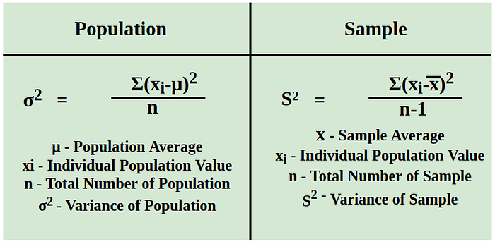
Symbols: Population: σ2, Sample: s2
2- Standard Deviation:
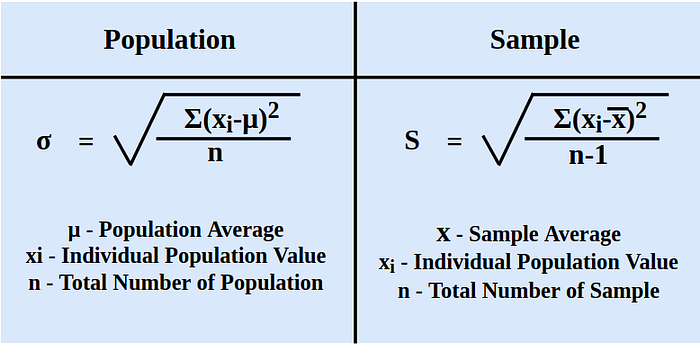
Symbols: Population: σ, Sample: s
The formula remains consistent, with the standard deviation being the square root of the variance.
Measure of Dispersion
Consider diving into the age diversity of users in a shooter game like Call of Duty, with the goal of making wise decisions on marketing techniques and game development. We rely on standard deviation and variance in this case. A rise in variance and standard deviation indicates more swing and a normal age gap between players.
And, when it comes to finance and investing, these statistics come into play to assess the risks associated with portfolio returns. If your standard deviation and variance are both high, it’s a red flag for a riskier investment.
import pandas as pd
import numpy as np

# Example dataset: Age of players in a shooter game (Call of Duty)
player_data = {'PlayerID': [1, 2, 3, 4, 5, 6, 7, 8, 9, 10],
               'PlayerAge': [25, 32, 28, 35, 22, 29, 30, 31, 27, 36]}

# Create a DataFrame
df_players_cod = pd.DataFrame(player_data)

# Calculate the variance and standard deviation
variance_age_cod = np.var(df_players_cod['PlayerAge'])
std_deviation_age_cod = np.std(df_players_cod['PlayerAge'])


# Output
Variance in Players Age: 17
Standard Deviation in Players Age: 4
Comparing Variability Between Groups
Consider a scenario where you’re comparing the monthly income of two McDonald’s branches located in different cities. The income might vary due to factors such as local festivals, tourist seasons, and overall economic conditions. Let’s simulate and analyze this scenario
import pandas as pd
import numpy as np
import matplotlib.pyplot as plt

# Simulate income data for two McDonald's branches in different cities
np.random.seed(42)

# Branch in City A
income_city_a = np.random.normal(50000, 10000, 12)  # Monthly income, mean=50000, std=10000

# Introduce a spike in income for City A during a festival
income_city_a[6] += 20000  # Festival month

# Branch in City B
income_city_b = np.random.normal(55000, 15000, 12)  # Monthly income, mean=55000, std=15000

# Introduce a spike in income for City B during tourist season
income_city_b[9] += 25000  # Tourist season month

# Create a DataFrame
df_income = pd.DataFrame({
    'Month': range(1, 13),
    'Income_City_A': income_city_a,
    'Income_City_B': income_city_b
})

# Calculate and display the variance and standard deviation
variance_city_a = np.var(df_income['Income_City_A'].to_numpy())
std_deviation_city_a = np.std(df_income['Income_City_A'].to_numpy())
variance_city_b = np.var(df_income['Income_City_B'].to_numpy())
std_deviation_city_b = np.std(df_income['Income_City_B'].to_numpy())


# Output
Variance City A: 124104494.9988625
Standard Deviation City A: 11140.219701552682
Variance City B: 276708231.16267926
Standard Deviation City B: 16634.54932249982
#5 Correlation

Correlation captures the direction and strength of the relationship between two or more variables, offering insights into whether one variable tends to increase or decrease as the other changes. This nuanced understanding proves invaluable when exploring connections between diverse aspects of a dataset, providing a quantitative basis for making informed decisions or predictions.
formula:

The output of correlation is between -1 to +1. Closer to +1 indicates a positively correlated relationship, meaning the variables move in the same direction. Closer to -1 indicates a negatively correlated relationship, signifying that the variables move in opposite directions.
Identifying Relationships
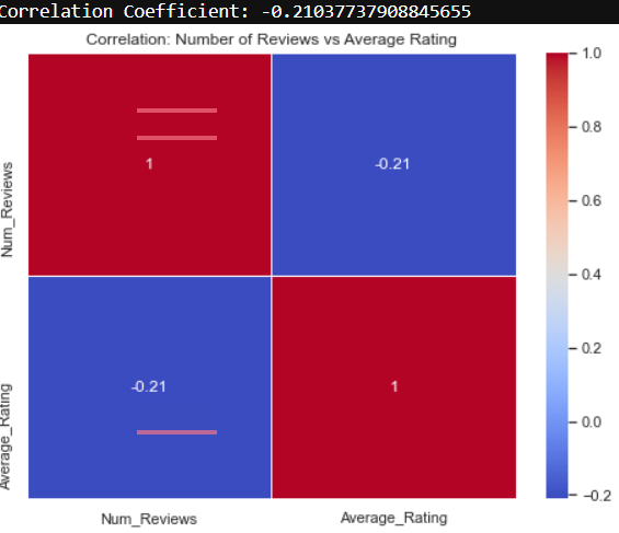
Suppose you are tasked with investigating whether there is a positive relationship between the number of product reviews and a high average rating. This is where correlation analysis becomes valuable
import pandas as pd
import numpy as np
import matplotlib.pyplot as plt
import seaborn as sns

# Simulate data for the example
np.random.seed(42)

# Generate random data for product reviews
num_reviews = np.random.randint(10, 100, 50)  # Number of reviews per product
average_rating = np.random.uniform(3.0, 5.0, 50)  # Average rating per product

# Create a DataFrame
df_reviews = pd.DataFrame({
    'Num_Reviews': num_reviews,
    'Average_Rating': average_rating
})

# Calculate and display the correlation coefficient
correlation_coefficient = np.corrcoef(df_reviews['Num_Reviews'], df_reviews['Average_Rating'])[0, 1]


print(f"Correlation Coefficient: {correlation_coefficient}")

# Plot the data using a heatmap
plt.figure(figsize=(8, 6))
sns.heatmap(df_reviews.corr(), annot=True, cmap='coolwarm', linewidths=.5)
plt.title('Correlation: Number of Reviews vs Average Rating')
Feature Selection
In machine learning problems in both regression and classification methods, for less computing and more accuracy, we may not feed all of our features into the model instead we use those with high relatability with the problem Correlation can help us with this, we remove features that are highly correlated together and keep those highly correlated with our target (Y). Fortunately, Sklearn made it a lot easier by providing “SelectKBest” which does the same automatically by determining K (the number of features you want to pick).
In the following example, I used a popular basic dataset called Iris Flowers for both regression and classification by applying SelectKBest:
import pandas as pd
from sklearn.datasets import load_diabetes
from sklearn.model_selection import train_test_split
from sklearn.linear_model import LinearRegression
from sklearn.feature_selection import SelectKBest, f_regression, f_classif
from sklearn.metrics import mean_squared_error, accuracy_score
from sklearn.ensemble import RandomForestClassifier

# Load a regression dataset (e.g., diabetes dataset)
data = load_diabetes()
X_reg = pd.DataFrame(data.data, columns=data.feature_names)
y_reg = data.target

# Load a classification dataset (e.g., iris dataset)
from sklearn.datasets import load_iris
iris = load_iris()
X_cls = pd.DataFrame(iris.data, columns=iris.feature_names)
y_cls = iris.target

# Split the data into training and testing sets
X_train_reg, X_test_reg, y_train_reg, y_test_reg = train_test_split(X_reg, y_reg, test_size=0.2, random_state=42)
X_train_cls, X_test_cls, y_train_cls, y_test_cls = train_test_split(X_cls, y_cls, test_size=0.2, random_state=42)

# Use SelectKBest with f_regression for regression feature selection
num_features_to_select_reg = 5
selector_reg = SelectKBest(score_func=f_regression, k=num_features_to_select_reg)
X_train_selected_reg = selector_reg.fit_transform(X_train_reg, y_train_reg)
X_test_selected_reg = selector_reg.transform(X_test_reg)

# Use SelectKBest with f_classif for classification feature selection
num_features_to_select_cls = 2
selector_cls = SelectKBest(score_func=f_classif, k=num_features_to_select_cls)
X_train_selected_cls = selector_cls.fit_transform(X_train_cls, y_train_cls)
X_test_selected_cls = selector_cls.transform(X_test_cls)

# Regression Example: Train a Linear Regression model using selected features
model_reg = LinearRegression()
model_reg.fit(X_train_selected_reg, y_train_reg)

# Classification Example: Train a RandomForestClassifier using selected features
model_cls = RandomForestClassifier()
model_cls.fit(X_train_selected_cls, y_train_cls)
Outliers:

Outliers are data points far away from most of the data. Imagine someone who tips 100 times more than usual. Or at the company, if the average employee’s annual earnings are 50.000$ and some employees are 250.000$. Outliers are not necessarily errors but they can cause an error. In EDA (Exploratory data analysis) according to the nature of the data and analysis.
#6 IQR
IQR (Interquartile Range) is a popular way to detect and remove outliers. The way it works is to calculate the median and then divide the dataset into two quantiles: Q1, which represents the 25th percentile, and Q3, which represents the 75th percentile.
The IQR is then the range between Q1 and Q3. By establishing this middle range, values highly below or above it are identified as outliers or data points outside the bounds of Q1–1.5 * IQR or Q3 + 1.5 * IQR are considered outliers. In the following example, I used IQR to remove outliers of a house pricing data for feature analysis and modeling.
Formula: IQR=Q3−Q1
import pandas as pd
import matplotlib.pyplot as plt
import seaborn as sns

# Assume you have a dataset with house prices and features
# Load or create a dataset (e.g., for illustration purposes)
data = {
    'SquareFootage': [1500, 1800, 2000, 2100, 2200, 2300, 2400, 3000, 3200, 3500, 3700, 3800, 4000],
    'Bedrooms': [3, 4, 3, 4, 4, 3, 4, 5, 4, 5, 5, 6, 6],
    'DistanceToCityCenter': [5, 6, 7, 8, 10, 12, 15, 18, 20, 22, 25, 30, 35],
    'Price': [300000, 350000, 320000, 400000, 420000, 380000, 450000, 550000, 580000, 600000, 650000, 700000, 750000]
}

df = pd.DataFrame(data)

# Visualize the distribution of house prices before handling outliers
plt.figure(figsize=(8, 6))
sns.boxplot(x=df['Price'])
plt.title('House Prices Distribution (Before Outlier Handling)')
plt.show()

# Function to handle outliers using IQR
def handle_outliers_with_iqr(dataframe, column):
    Q1 = dataframe[column].quantile(0.25)
    Q3 = dataframe[column].quantile(0.75)
    IQR = Q3 - Q1
    lower_bound = Q1 - 1.5 * IQR
    upper_bound = Q3 + 1.5 * IQR
    dataframe_no_outliers = dataframe[(dataframe[column] >= lower_bound) & (dataframe[column] <= upper_bound)]
    return dataframe_no_outliers

# Apply IQR to handle outliers in the 'Price' column
df_no_outliers = handle_outliers_with_iqr(df, 'Price')

# Visualize the distribution of house prices after handling outliers
plt.figure(figsize=(8, 6))
sns.boxplot(x=df_no_outliers['Price'])
plt.title('House Prices Distribution (After Outlier Handling)')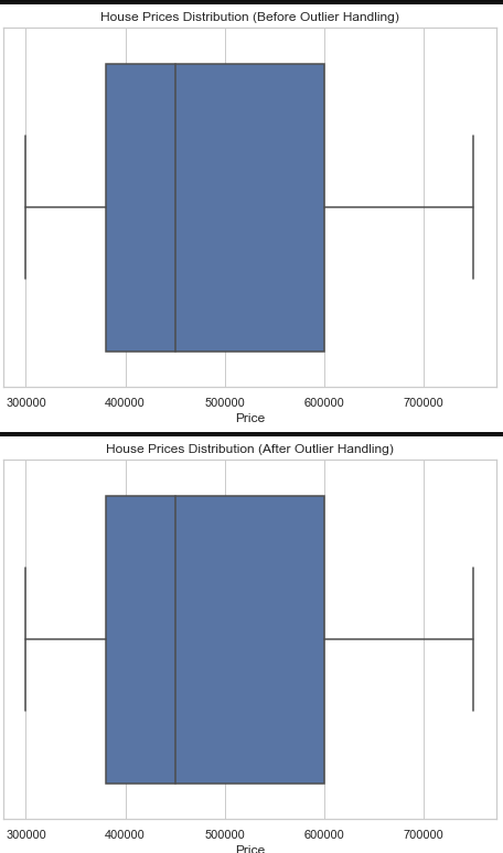
#7 z-score
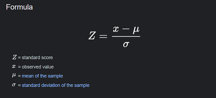
Z-score measures how many standard deviations a particular data point is away from the mean of the dataset. If a Z-Score is positive, it means the data point is above the mean, and if it’s negative, it means the data point is below the mean and if it’s positive it means it is above the mean it has many usages in data science and data analytics projects that I’m going to show
formula:
Identifying and Removing Outliers
Take, for example, the house pricing dataset that we utilized for house pricing. This time, I’m going to use z-score to remove the outliers. It operates by setting a threshold and calculating the z-score of each data point. If the data exceeded the threshold we established, it was categorized as an outlier.
import pandas as pd
import matplotlib.pyplot as plt
import seaborn as sns
from scipy.stats import zscore

# Assume you have a dataset with house prices and features
# Load or create a dataset (e.g., for illustration purposes)
data = {
    'SquareFootage': [1500, 1800, 2000, 2100, 2200, 2300, 2400, 3000, 3200, 3500, 3700, 3800, 4000],
    'Bedrooms': [3, 4, 3, 4, 4, 3, 4, 5, 4, 5, 5, 6, 6],
    'DistanceToCityCenter': [5, 6, 7, 8, 10, 12, 15, 18, 20, 22, 25, 30, 35],
    'Price': [300000, 350000, 320000, 400000, 420000, 380000, 450000, 550000, 580000, 600000, 650000, 700000, 750000]
}

df = pd.DataFrame(data)

# Visualize the distribution of house prices before handling outliers
plt.figure(figsize=(8, 6))
sns.boxplot(x=df['Price'])
plt.title('House Prices Distribution (Before Outlier Handling)')
plt.show()

# Function to handle outliers using Z-Score
def handle_outliers_with_zscore(dataframe, column, threshold=3):
    z_scores = zscore(dataframe[column])
    dataframe_no_outliers = dataframe[(abs(z_scores) < threshold)]
    return dataframe_no_outliers

# Apply Z-Score to handle outliers in the 'Price' column
df_no_outliers_zscore = handle_outliers_with_zscore(df, 'Price')

# Visualize the distribution of house prices after handling outliers
plt.figure(figsize=(8, 6))
sns.boxplot(x=df_no_outliers_zscore['Price'])
plt.title('House Prices Distribution (After Outlier Handling with Z-Score)')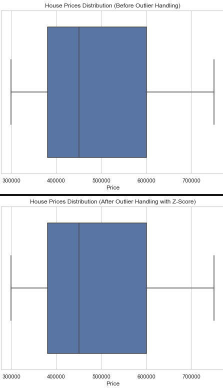
Standardizing Data
When preprocessing and preparing data for modeling, data can come in many units and scales such as KG, cm, sec, etc., which can increase model computing and data complexity. z-score Solve this problem by rescaling all data, regardless of unit, into a single unit ranging from 0 to 1. It’s like a spell that makes all of the garments in the same size fit the wearer.
import pandas as pd
from sklearn.preprocessing import StandardScaler

# Create a sample DataFrame
data = {'Height (cm)': [170, 165, 180, 155],
        'Weight (kg)': [70, 60, 80, 50],
        'Time (sec)': [16000, 15000, 8000, 12000]}

df = pd.DataFrame(data)

# Display the original DataFrame
print("Original DataFrame:")
print(df)

# Scale the data using Z-Score
scaler = StandardScaler()
scaled_data = scaler.fit_transform(df)

# Create a new DataFrame with scaled data
df_scaled = pd.DataFrame(scaled_data, columns=df.columns)

# Display the scaled DataFrame
print("\nDataFrame with Z-Score Scaled Data:")
print(df_scaled)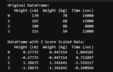
#8 Statistical Distributions
In the realm of statistics, data representing real-life phenomena tends to manifest in diverse styles, each with its unique characteristics. There are common patterns, such as how people’s heights align in a particular area or the weights most individuals can manage effortlessly. Just like fashion and the varied styles people adopt, although there’s a multitude of trends, certain customs persist, like suits, police uniforms, or cook uniforms. Observing them allows you to gather information or make assumptions about individuals.
Now, among the numerous distributions, three types stand out more than others:
1- Normal Distribution
The most common distribution is normal distribution also known as Gaussian distribution. it’s when the majority of data is located in the center of distribution like a belly curve near the mean and median. For instance, the Height of people in a country, and the blood pressure of healthy people all naturally follow the normal distribution
import numpy as np
import matplotlib.pyplot as plt

# Generating data that follows a normal distribution
mean_height = 170  # Mean height in centimeters
std_dev_height = 10  # Standard deviation of height

# Generating a sample of 1000 data points with a normal distribution
height_data = np.random.normal(mean_height, std_dev_height, 1000)

# Plotting the histogram to visualize the normal distribution
plt.hist(height_data, bins=30, density=True, alpha=0.7, color='blue')
plt.title('Normal Distribution: Height of People')
plt.xlabel('Height (cm)')
plt.ylabel('Probability Density')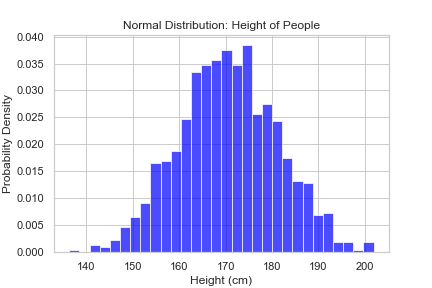
2- Binomial Distribution
Imagine you want to test something and the probability of an outcome is fixed result will be distributed in a Binomial. For instance, the result of medical tests always be (negative or positive ) or AD clicking on a website. In summary, it’s mainly used in our analysis we have analysis like classic AB Testing.
import numpy as np
import matplotlib.pyplot as plt

# Generating data that follows a binomial distribution
num_trials = 1000  # Number of trials
probability_of_success = 0.7  # Probability of success for each trial

# Generating a sample of 1000 data points with a binomial distribution
binomial_data = np.random.binomial(num_trials, probability_of_success, 1000)

# Plotting the distribution using Matplotlib
plt.figure(figsize=(8, 6))
plt.hist(binomial_data, bins=30, density=True, color='coral', alpha=0.7)
plt.title('Binomial Distribution: Medical Test Outcomes')
plt.xlabel('Number of Successes')
plt.ylabel('Probability Density')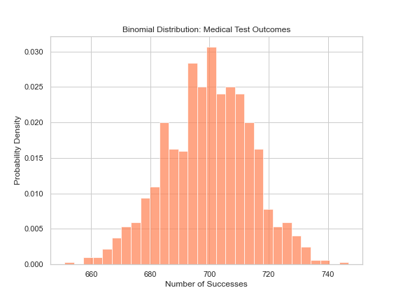
3- Poisson Distribution
We use the Poisson distribution when analyzing the outcomes of events occurring in a specific location and period of time. It’s important to note that these events are entirely independent and don’t influence each other. For instance, the number of customers clicking on a new ads banner over a week or estimating the number of users purchasing a specific product within an hour on an e-commerce website.
import numpy as np
import matplotlib.pyplot as plt

# Generating data that follows a Poisson distribution
average_rate = 5  # Average rate of events per unit of time or space

# Generating a sample of 1000 data points with a Poisson distribution
poisson_data = np.random.poisson(average_rate, 1000)

# Plotting the distribution using Matplotlib
plt.figure(figsize=(8, 6))
plt.hist(poisson_data, bins=30, density=True, color='green', alpha=0.7)
plt.title('Poisson Distribution: Number of Customers Clicking on an Ad Banner')
plt.xlabel('Number of Events')
plt.ylabel('Probability Density')
#9 Central Limit Theorem
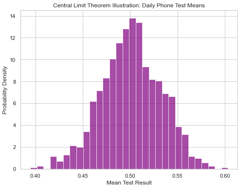
The Central Limit Theorem is like the superhero of stats! No matter how our data behaves originally when we calculate the average, it magically turns into a normal distribution. This is super handy when we’re checking how good and reliable our data is.
Let’s picture this with a mobile phone company. Every day, we grab 80 phones and give them a little test to see if they’re working their best. Now, imagine being an investor — you wouldn’t want to put your money in a company churning out wonky phones every day, right?
import numpy as np
import matplotlib.pyplot as plt

# Simulating the testing of phones
daily_tests = 80  # Number of phones tested each day
num_days = 1000  # Number of days to simulate

# Simulating the distribution of phone test results
phone_test_results = np.random.uniform(0, 1, (num_days, daily_tests))

# Calculating the mean of phone test results for each day
daily_means = np.mean(phone_test_results, axis=1)

# Plotting the distribution of daily means
plt.figure(figsize=(8, 6))
plt.hist(daily_means, bins=30, density=True, color='purple', alpha=0.7)
plt.title('Central Limit Theorem Illustration: Daily Phone Test Means')
plt.xlabel('Mean Test Result')
plt.ylabel('Probability Density')
The Simpson’s Paradox:
Consider an analysis comparing the performance of two hospitals, A and B, based on a statistical test with the key metric being the number of successfully healed patients. Both hospitals have treated 400 patients each, and the results show that Hospital A has 340 healed patients while Hospital B has only 40. At first glance, it might seem that Hospital A is performing better.
However, the oversight here is the type of diseases that the patients had. Upon further examination, it becomes apparent that Hospital A treated patients with more dangerous diseases. Meanwhile, Hospital B had a majority (90%) of patients with severe cases of cancer. This crucial variable, the type of disease, significantly influences the analysis.
Simpson’s Paradox occurs when the overall comparison masks important nuances present in subgroups. In this case, failure to account for the variable of disease type in the statistical test led to a potentially misleading conclusion about the hospitals’ performances.
#10 Hypothesis Testing

Hypothesis testing, a crucial statistical tool, guides decisions in uncertain situations. Imagine being a data scientist in the midst of the COVID-19 pandemic, working on a vaccine promising quicker, more effective results. Alternatively, picture yourself in an e-commerce team testing a new ads banner — aiming not just for attractiveness but superior performance.
Navigating uncertainty is inherent for a data scientist. Picture being immersed in medical research or testing a new banner for an e-commerce company. Both scenarios fall under AB testing, a method comparing two variants for superior performance. Our main focus is on hypothesis testing, a critical component within the AB testing framework.
Now, let’s delve into testing a new ad banner example and explain the hypothesis statement with a practical example:
Imagine it like a court
Null Hypothesis (H0)
Assumes there is no significant difference or improvement in performance (Accused in guilty).
In our case:
The average performance (click-through rate) of the new ad banner is equal to or less than that of the current banner.
Alternative Hypothesis (H1)
Suggests there is a significant difference or effect compared to H0 or the current statement (Accused is innocent).
In our case:
The average performance of the new ad banner is significantly higher than that of the current banner.
Type 1 & 2 Errors
Type1 Error
This happens when we mistakenly reject the H0 or assume it’s false when it’s true (Accused is innocent but we define him as guilty (False Positive))
In our case:
Incorrectly concluding that there is an effect or difference when there isn’t.
Type 2 Error
This happens when we accept H0 incorrectly when H1 is true (Accused is guilty and we define him as innocent (False Negative))
In our case:
Incorrectly concluding that there is no effect or difference when there actually is.
Fundamental Components
To test our hypothesis in a controlled and accurate way, we have to determine the components of hypothesis testing:
P-value
In hypothesis testing, the p-value is the strongness of our evidence against H0. The smaller our p-value the higher the possibility of rejecting H0 (It’s the evidence we collect against the accused to find out whether he is guilty or not).
Alpha (α)
In hypothesis testing, alpha acts like a threshold value to prevent us from making Type 1 errors.
In court example it determines the level of evidence we should collect to to call the accused guilty. We often set it as a small value like 0.05 or (5%) meaning our evidence should be very strong enough to charge the accused (we don’t want to put someone mistakenly in jail :)
Note: It doesn’t always have to be 5%, It can be dynamic according to the confidence level you want from the test (In the example of the court, the alpha value changes based on the crime level).
If the p-value is less than the chosen significance level (α), we reject the null hypothesis (H0), indicating statistical significance.
Power
Power is the level we set to ensure we correctly accept H1. It’s like a rule we establish to avoid mistakenly rejecting the innocence of the accused. We determine it by 1−β (beta). We usually set it at 80%, leaving 20% to accept the risk of not detecting a true effect. We set it to make sure there is still a probability we mistakenly accept the null hypothesis and to remind us not to be sure 100%.
Calculating the p-value
Now we set our experiment and the case of our accused is ready to be judged, It’s time to investigate (calculate the p-value). Just like real investigation where according to the type of crime, the way we collect evidence is different. Meaning according to the type and distribution of our data the way we calculate
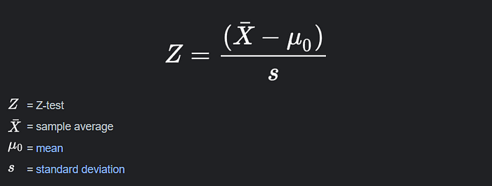
Z-test
We use the z-test when comparing a sample mean to a known population mean and when the population standard deviation is known.
Formula:
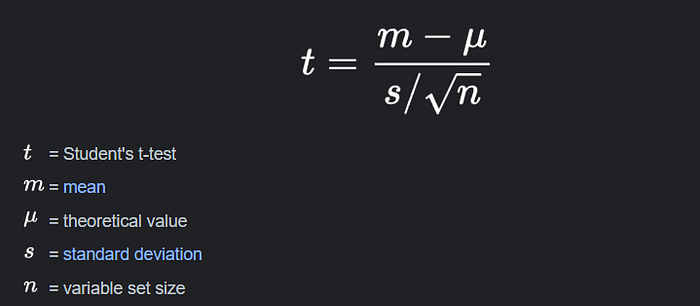
T-test
When comparing the means of two independent groups or when working with a limited sample size and unknown population standard deviation, we use the t-test.
Formula:
ANOVA (Analysis of variance)
ANOVA is useful when comparing the means of more than two groups. It allows us to determine whether there are any significant variances in the group averages. The best part? ANOVA isn’t picky about requiring a certain population standard deviation, and the greatest aspect is that it works well with both small and large sets of data.
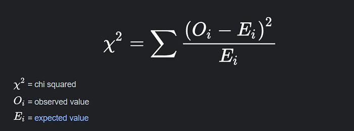
Chi-Square Test
Chi-Square is a statistical test that is created primarily for categorical data in hypothesis testing. With higher sample numbers, its performance becomes more trustworthy. Consider an e-commerce situation in which you want to investigate the relationship between the sentiment of product reviews (positive or negative) and the level of consumer satisfaction (satisfied or dissatisfied). In such instances, the Chi-Square test can be used to analyze the relationship between categorical variables.
Formula:
New Ad Banner Example:
Imagine an e-commerce website wanting to test a new method of displaying ad banners, assuming it achieves a higher Click-Through Rate (CTR) than the current one. The banner is positioned on the main page, and shown randomly to active users in a week. Data is collected on how much each banner receives in terms of CTR to assess whether it is worthwhile to implement the new banner feature. Here are the assumptions:
H0: There is no difference in CTR between the current and new banners.
H1: The new banner has a higher CTR than the current one.
import pandas as pd
from scipy.stats import ttest_ind

# Hypothetical data for CTR (Click Through Rate) of the current and new banners
data = {
    'Current_Banner': [0.12, 0.15, 0.1, 0.14, 0.11, 0.13, 0.12, 0.14, 0.12, 0.13],
    'New_Banner': [0.18, 0.22, 0.19, 0.21, 0.17, 0.20, 0.23, 0.18, 0.19, 0.21]
}

df = pd.DataFrame(data)

# Set significance level (alpha)
alpha = 0.05

# Two-sample t-test
t_stat, p_value = ttest_ind(df['New_Banner'], df['Current_Banner'], alternative='greater')

# Print the results
print("t-statistic:", t_stat)
print("P-value:", p_value)

# Interpret the results
if p_value < alpha:
    print("Reject the null hypothesis. The new banner has a significantly higher CTR than the current one.")
else:
    print("Fail to reject the null hypothesis. There is no significant difference in CTR between the current and new banners.")
Alright, data aficionados, we’ve reached the end of our statistical joyride! 🎉 That’s a wrap on the essentials, from populations to hypothesis testing.
Hope you had as much fun reading as I did scribbling this down. Now, here’s the deal — stats is a powerhouse. It’s not just numbers on paper; it’s your ticket to decoding the data mysteries. In this ever-evolving tech world, stats is your timeless buddy.
So, as you dive into the data universe, keep this in your back pocket — no matter how smart AI gets, stats is your secret sauce. It’s the unsung hero behind every meaningful data tale.
This was a sneak peek into the statistical wonderland, but trust me, there’s a whole galaxy out there. Explore it, experiment with it, and make stats your own. It’s not just a subject; it’s a superpower waiting for you to unleash.
Thanks for joining me in this article. Go on, be your own data maestro, and may your data explorations be nothing short of legendary!
Until next time, happy painting the world of data with the colors of statistics! 🚀✨
If you have any questions or feedback, feel free to share them in the comment section below.